The grass must be green, the strip yellow
Unlike most other sports, cricket needs to look right to its fans, from the colour of the grass, the pitch and the stumps to the quality of the light
Jonathan Wilson
02-Dec-2013
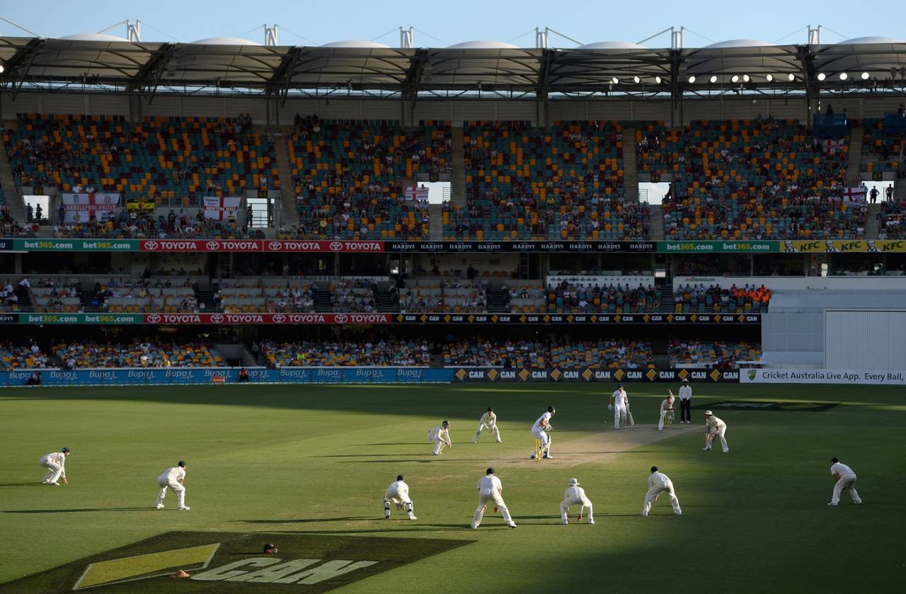
In the spectator's mind, every series has a colour chart • Getty Images
I don't like those yellow stumps. Of all the things that were wrong with the first Test between Australia and England at the Gabba, the most wrong was the colour of the stumps. This is not, I realise, the sort of issue that's going to rally others to the barricades, or having them marching on to Dubai, but still, it seems to matter.
Cricket, more than any other game, with the possible exception of golf, is reliant on its aesthetic. A golf course may be a stunning test but it needs to look right as well: it needs to have the bleakness of the dunes or the manicured beauty of a park; it can't just be strips of grass of various lengths and the odd sandpit laid out in a car park. Similarly cricket, perhaps because of the length of time it's on, the way that for those of us watching on television it inhabits a corner of the room for hours at a time, has to get the aesthetic right.
Now that's not something that's simple to explain. It's not necessarily about looking beautiful. Some grounds do, of course: Lumley Castle looming over the Riverside at Chester-le-Street, redolent of the ghosts of Shane Watsons past; the pavilion at Lord's, reeking of history and daring batsmen to repeat Albert Trott's feat of striking the ball over it; the fort frowning over the inadequate ticketing arrangements at Galle. That's part of it, and you wonder with a sense of unease how the redevelopment at Adelaide will pan out.
But there's also a place in the aesthetic for the more functional: the concrete ring of the Gabba, the old brick pavilion at Headingley that seemed to have been designed to evoke an ordinary semi on a 1960s housing estate, the towering stands of the Wanderers. Some grounds manage to combine both: Cape Town has both Table Mountain and that brewery. But it's not really about prettiness or ugliness - it's about appropriateness. And that, of course, is a meaningless term, because it's so subjective.
I remember watching England's three-wicket defeat to West Indies in Port-of-Spain in 1998 and having the nagging sensation of having been there, even though I knew I'd never been to the Caribbean. Eventually, midway through the morning of the fifth day, as Carl Hooper compiled a match-winning 94 not out, it dawned on me: there was something about the Queen's Park Oval that reminded me of the bus station in Dharamsala in northern India. In part, perhaps, it was the deep maroonish-brown supports on the stand, but primarily the similarity was something to do with the quality of the light.
For Australia, the grass needed to be a rich green and the strip a sandy yellow; the sound needed a strange echoiness; there had to be needlessly bright computer graphics and a cartoon duck accompanying batsmen who had made nought off the pitch
That, in turn, sparked a greater revelation, which is that every tour England go on has its own light quality: the dusty shimmer of Pakistan, the damp greens of New Zealand, the heavy, saturated brightness of Sri Lanka. Of course it wasn't constant, of course it changed from ground to ground, from day to day, but there was still a colour chart for each series.
And for Australia, for like all England fans of my generation, it was on the grand slam tour of 1986-87 that I really began to obsess about such things, there was a very clear aesthetic. The grass needed to be a rich green and the strip a sandy yellow; the sound needed a strange echoiness; there had to be needlessly bright computer graphics and a cartoon duck accompanying batsmen who had made nought off the pitch ("Why do they do that, Dad?" I asked. "They're a childish people, the Australians," he said, with a glance over his newspaper); the higher stands meant a higher camera angle that emphasised how far back the wicketkeeper was standing, and the majority of the advertising hoardings had to be garish yellow to fit the Benson and Hedges sponsorship.
But amid all the differences, one thing remained comfortingly the same: the stumps were made, overtly, of wood. And, more than that, it was pale wood, not the dark, heavily varnished wood of the spring wickets we used at school. Because pale wood was what proper players used. Not dark wood. And definitely, absolutely, categorically not yellow-coated wood.
I reckon if you showed me an inch square of footage from any football World Cup from 1950 to 1998, I could tell you which tournament it was, provided I could see grass (more recently, as everything's become homogenised, it's much harder). I like the fact that cricket used to be the same, each with their own unique characteristics, so that at a glance you could see which country the game was being played in (for instance, the small clip of Sachin Tendulkar batting in Slumdog Millionaire, which is said to be in Mumbai, clearly isn't: the shade of green is wrong; it's blatantly Stormont green).
I realise, of course, that what I'm saying is that I want everything to be the same as it was in the eighties and nineties, and that things shouldn't change from the moment at which I decided they felt right, and that that essentially is ridiculous.
But, on the other hand, those stumps were yellow.
Jonathan Wilson writes for the Guardian, the National, Sports Illustrated, World Soccer and Fox. He tweets here