The idea of shirtism
The colour of the team jersey may affect fan loyalty, but not how the team plays
Andrew Hughes
Apr 21, 2013, 7:00 AM
A basic art appreciation course will teach you that that's a phoenix-shaped shuttle charging past the earth's atmosphere into outer space in search of a galaxy far, far away • BCCI
Last Friday, like the vicar bringing the village fete to an end, David Hopps gave us the closing speech at the annual county cricket versus IPL festivities. Now it's time to take down the bunting, let all the hot gas out of the balloons, and put away the placards until next April. No more words need be wasted on the subject. Apart from the next 172.
I'm English. I don't have a passport to prove it, but I can assure you I am. I get grumpy when people don't queue properly. I find the weather an endless conversational resource. I lament the rise of the hug and the decline of the handshake. Yet despite being English, I have no angst at all over the IPL. Every April, I take the cricket menu from Gower, the elderly waiter, scan the options, and plump for the IPL Souffle over County Pie and Chips.
I prefer to watch the IPL because it's fun. Be honest, I bet some of you sneered a little when you read that sentence. Well, unless you play it or write about it for a living, sport is entertainment. The prospect of having fun is what gets people through the turnstiles. The IPL is fun, and worse still, it's exciting. It also features most of the world's best players, it's on free-to-air television, and I can fit it in between the ironing and de-lousing the cat.
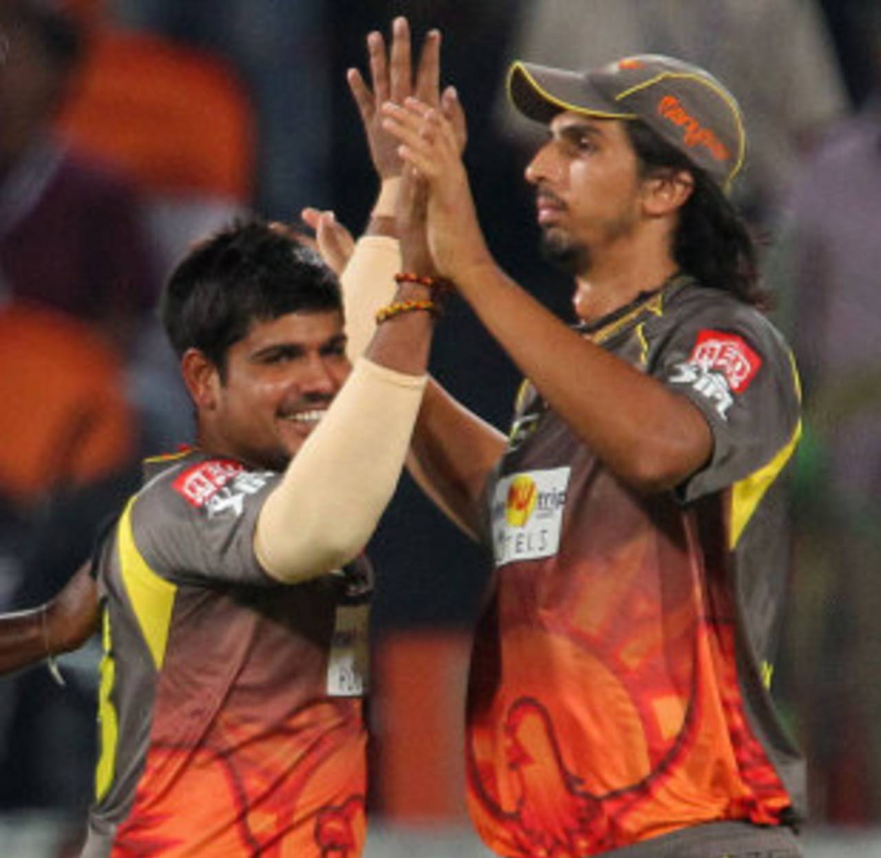
But otherwise, it was hard to argue with his thoughtful piece. And he did hit on something profound and important that should give all of us who watch the IPL pause to reflect. Why exactly have the Sunrisers Hyderabad gone for such an appalling outfit?
I can remember, as a boy, colouring in the shirts of football teams, and being enraptured by the wistful summer-sky blue of Manchester City, awe-struck by the brown Baroque of Coventry's 1978 strip, intrigued by Plymouth's daringly continental splash of green, and dazzled by the Dadaist lime and lemon stripes of the West Bromwich Albion away shirt.
Constrained by geography, I couldn't let mere colours influence my choice of football team, but when you're thousands of miles away, aesthetics matter. A poor colour choice or a dodgy logo can be enough to tip the balance of the far-flung floating cricket voter.
So what choices do we have in the IPL? The state of Rajasthan includes the Blue City, so they are probably entitled to say they own the colour. Mumbai's blue is basically the same blue as Rajasthan's but splashed all over with gold bling, and will appeal to the kind of person who would buy a diamond-encrusted tin-opener in the belief that if it is a thousand times more expensive than a normal tin-opener it must be better at opening tins.
Kolkata have gone with a daring aubergine and mustard concoction, whilst Pune have pulled off the considerable feat of pinning down the exact colour of seasickness. Delhi's outfit reminds me of the kind of pyjamas that I would have loved when I was a boy: red and blue, superhero colours; which is rather poignant, given their performances. Bangalore's tomato ketchup on a Ferrari is a little too obvious, but will appeal to a certain type.
But though Hyderabad's sartorial symphony in grey is bad, it is not the worst IPL strip. And they can draw comfort from the fact that being badly dressed is no impairment to success.
Chennai's shirt is boldly, defiantly awful; a bilious cocktail of bananas, cheese and custard. If the team were no-hopers, that shirt would be the final indignity; a gaudy embarrassment forcing players to flap about like man-sized canaries. But Chennai are frequent winners. In its tackiness, their shirt deconstructs the very idea of shirtism. We can wear anything, it seems to say. Put us in clown costumes, tutus or diving suits, it doesn't matter. We'll still win.
Andrew Hughes is a writer currently based in England. He tweets here